Week2 -- ggplot2
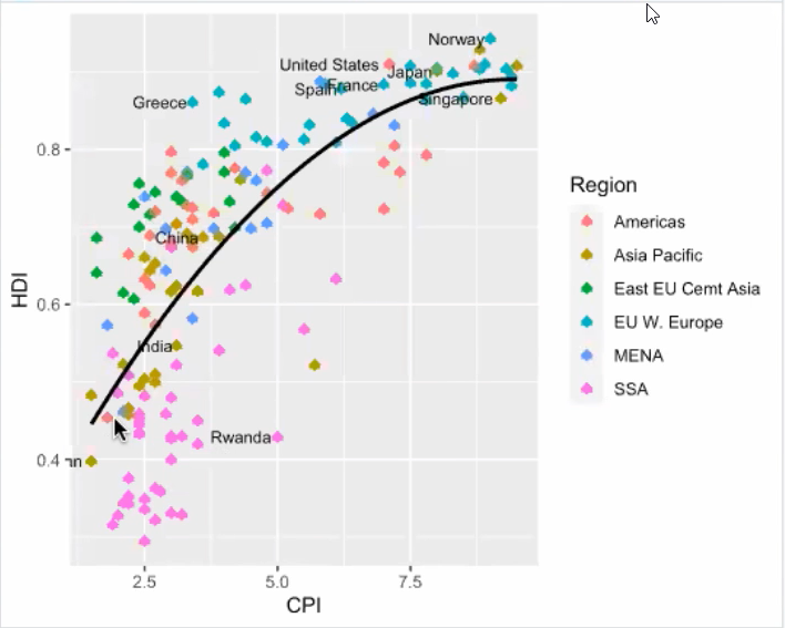
ggplot2-cheatsheet 常用函数: • geom_bar(): creates a layer with bars representing different statistical properties. • geom_point(): creates a layer showing the data points (as you would see on a scatterplot). • geom_line(): creates a layer that connects data points with a straight line. • geom_smooth(): creates a layer that contains a ‘smoother’ (i.e., a line that summarizes the data as a whole rather than connecting individual data points). • geom_histogram(): creates a layer with a histogram on it. • geom_boxplot(): creates a layer with a box–whisker diagram. • geom_text(): creates a layer with text on it. • geom_density(): creates a layer with a density plot on it. • geom_errorbar(): creates a layer with error bars displayed on it. • geom_hline(), geom_vline(): straight lines 读取ggplot require(ggplot2) # load ggplot2 first 一般不用 library(ggplot2) ggplot里面aes坐标轴,ggplot是坐标系和画布 gem_point()则是数据点加到图上,里面的aes就是把sex用不同形状,state不用颜色 facet_wrap() 按照Sex分成多个子图;若按多个元素分成子图,则用facet_grid(Sex~State) ggplot(myData, aes(Year, Number)) + geom_point(aes(shape = Sex, color = State)) +facet_wrap(~Sex)这里的shape表示点的样式,可以输入其他数字换样式 plot1 <- ggplot(dat, aes(x = CPI, y = HDI, color = Region)) + geom_point(shape = 1) 在图上加Label labels <- c("Congo", "Sudan", "Afghanistan", "Greece", "China", "India", "Rwanda", "Spain", "France", "United States", "Japan", "Norway", "Singapore") plot2 <- plot1 + geom_text(aes(label = Country), color = "black", size = 3, hjust = 1.1, data = dat[dat$Country %in% labels, ])
在图上加回归线(Regression line) plot3 <- plot2 + geom_smooth(aes(group = 1), method = "lm", color = "black", formula = y~ poly(x, 2), se = FALSE)